Would you believe that the U.S. has 4 times more people interested in cloud computing than Europe? How about 5 times more people so interested than Asia? It is impossible to derive irrefutable evidence to validate those statements, but this blog entry offers one concrete data source that indicates those statements are true.
There have been various studies on cloud adoption and mindshare. For a young industry, it is an important metric to understand. Just this week, Chris Marino started a cloud adoption topic thread on the Cloud Google Group. He cited the Pew's report on American adoption of cloud applications.
This blog entry provides more data for that discussion. However, it focuses not on the adoption rate within the U.S., but the relative interest in cloud computing topics across continents. It uses traffic data from my blog as the input into the analysis.
Aggressive Extrapolation
Just to give you fair warning, I am about to draw sizable conclusions from a single source of data. This data source, traffic to my blog, cannot be proven to be a meaningful measurement. But I am writing this blog entry anyway because I think it is an interesting topic and the data might be meaningful. Also, I find there is an absence of information on this topic out on the net, so I hope this is a good starting point for other studies.
Here are a couple of assumptions I am making during this analysis:
- Given that blog access is location independent, there is an equal opportunity across regions for any cloud computing enthusiast to read my cloud blog entries
- Given equal opportunity, the readership of my cloud blog entries roughly matches interest level in each region for the topic of cloud computing in general
You could certainly argue that my blog does not generate enough traffic to be a significant measure. You could also argue that the level of blog readership in general isn't consistent across the regions.
You could also probably find about ten other reasons why this study is not conclusive. Once again, I hope this is a starting point for others to contribute meaningful data, and so this blog entry will be published despite the possible objections.
The Raw Data: Blog Readership Numbers
I will first introduce the raw visitor numbers of a handful of blog entries, as captured by Google Analytics. Later sections will explain the data and what to look for in these numbers.
| Blog Entry | Cat gory | Visits | U.S. % | Europe % | Asia % |
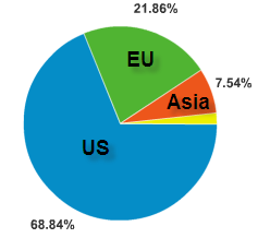
| Cloud Taxonomy V2 | Cloud | 1631 | 67 | 17 | 13 |
| Cloud Taxonomy V1 | Cloud | 1172 | 63 | 20 | 15 |
| SaaS Taxonomy | SaaS | 207 | 54 | 18 | 26 |
| SaaS for IBM, ORCL... | SaaS | 191 | 40 | 32 | 25 |
| SaaS Contract Analysis | SaaS | 196 | 69 | 22 | 8 |
| Control 1 | Ctrl | 131 | 51 | 27 | 16 |
| Control 2 | Ctrl | 363 | 53 | 24 | 21 |
A few words on the data collection gathered from Google Analytics:
- These numbers reflect visits between July 1, 2008 and September 14th 2008
- Some of the entries were not available during the entire collection period.
- They do not include RSS readers, as my feed exposes the entire entry
- Some of the older entries started life on a different blog system before being migrated to this blogspot account in May. Some clicks may have gone to the older blog system for those entries and were not captured.
- Visits are unique visitors, which each may account for one or more pageviews
- The numbers don't add up to 100% due to hits coming from places outside the three regions
Primary Evidence: Cloud Computing Visual Map Entry
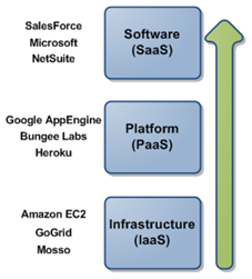
The primary piece of evidence, and the one from which I drew the main conclusions, is an entry made on September 8th 2008. It is titled "Cloud Taxonomy V2" in the table above. The blog entry contains the second version of a vendor map I have drawn that visualizes the cloud computing industry. I pick this entry as the primary evidence for the following reasons:
- It is very recent, and therefore very "clean" in terms of tracking actual human users reading the entry
- It is an entry with general appeal - it covers the industry as a whole. It therefore should represent a broad measurement of interest.
- It has enough visitors (1631) to make for a good sample size
The evidence reveals the following distribution:
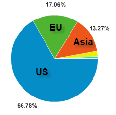
It is from this data that the main conclusions are drawn:
- U.S. interest in the topic of cloud computing is 4 times greater than in Europe
- U.S. interest in the topic of cloud computing is 5 times greater than in Asia
Look also at the numbers associated with the blog entry listed as "Cloud Taxonomy V1". That was the first version, released in May of this year. It is comforting to see that the V1 numbers roughly match the V2 numbers.
What About the SaaS Numbers?
You will notice that the SaaS themed blog enties don't carry the same distribution as the cloud entries. This is odd, as SaaS is a subset of cloud computing (see the referenced taxonomy diagram if you want to see why).
Specifically, look at the first two SaaS blog entries, found here and here. See how the U.S. has a lower share of the readership than with the cloud taxonomy entries:

One fabricated explanation - its about early adopters?
- The U.S. contains a higher percentage of early adopters (hypothesis)
- The overall cloud computing industry is still quite young , and dominated by early adopters. Therefore, the U.S. has a greater share of the readership of the general cloud taxonomy entries.
- SaaS is further along in adoption than the overall cloud computing industry. Therefore, you will see more balance in the interest levels.
Now look at the third SaaS entry - the one titled SaaS Contract Analysis. This one actually shows a higher distribution for the U.S. relative to the cloud taxonomy entries. Why?
Once again, a totally fabricated explanation - does this show Adoption as opposed to Mindshare?
- The SaaS Contract blog entry contains an analysis of SaaS contract terms, and suggested terms to avoid as a customer.
- This is not an entry for future thinkers or those just kicking the tires. This entry is primarily useful for those actually implementing SaaS and who need to review contracts with vendors. Perhaps this may show actual adoption, while the data for other entries show mindshare/interest?
Seeking a Control: My Non-Cloud/SaaS Blog Entries
While in recent times I have focused my external writing on Cloud Computing and SaaS topics, I also have written on topics such as mashups and Java security. To help shed more light on the numbers revealed above, I offer two of those blog entries as a control for this analysis. These may indicate what bias already exists in my blog readership.
Or they may not - most of my readers find my blog via search engines, not because they are regular subscribers. Therefore I would argue that these other blog entries don't offer much insight. But they are included anyway for your review.
Other Data Points on Cloud Mindshare and Adoption
There are other publicly available surveys on various adoption rates and mindshare. I would contend that none of these provide data for the specific discussion above, but they are interesting all the same:
- Kevin Jackson uses Google searches to understand what vendors have mindshare in the Cloud space (including me! - thanks Kevin)
- Chris Marino of SnapLogic started a thread on American adoption rates recently on the Cloud Google Group. He referenced the Pew report, and a few more links popped up.
- John B. Horrigan of Pew offers a survey of cloud application usage in the US.
- Duncan Riley also discusses the American adoption of online productivity suites.
- McKinsey presents a global comparison of adoption of Web 2.0 technologies. This does not cover cloud, but I see Web 2.0 as a loosely related market.
- Gartner recently released a report called Hype Cycle for Emerging Technologies, 2008. I don't have access to this research however, so can't comment on its contents.
Call for Collaboration
This analysis would be helped immensely by having access to more data sources. Cloud bloggers - what are you seeing? Cloud vendors, what can you say about your customers? Please reveal!
Also, the raw spreadsheet data from Google Analytics for my cloud v2 entry is here. If you would like a different export of the data, let me know.